

Beyond Content: The Elements that Make Listeners Click Play


Over the last few weeks, we’ve covered scraping the web, extracting content interesting to our users, and clustering that content into topical segments. It’s now time to create the podcast itself! In this post, we’ll be discussing the process and challenges of creating the transcript, episode titles and descriptions, and cover art. We’ll leave audio generation to next week’s post.
Transcript
As we explained in the clustering post, we cannot simply pass all of the source content to an LLM and ask it to generate a podcast due to context window limits. Instead, we decide to independently pass each semantically similar batch of content through an LLM and ask it to generate a summary. But how does this become a cohesive transcript?
The first step is to order our podcast sections. It would be unnatural if, for instance, an NFL podcast spoke about the Eagles offense, top prospects for the playoffs, and then the Eagles coach. One would expect the podcast to cover sections related to a single team consecutively. We try to create the most intuitive order for content, the way a human would present it.
Next, we generate summaries for each cluster of content and glue them together. In the interest of transparency, we keep track of where we sourced our content from, so that users have access to full show notes later on. We try to ensure that the summaries focus on the content you will find most interesting and cut out everything else. At this point in the process, we don’t worry about flow or style.
Lastly, we take a final pass over the cobbled-together podcast sections and turn it into an actual transcript. This final pass is where the magic happens: where intros and conclusions are generated, where conversational asides are added, and the information turns into a dialogue.
There’s only one issue: LLM output is notoriously….boring. There are a couple of reasons for this. The main cause for the stifling of model creativity is the use of RHLF. Generally regarded as a step towards reliability, consistency, and a way to force model outputs towards what humans actually want, by design, it limits output diversity. There’s no such thing as “good” or “bad” entropy. There’s only entropy. A potential second cause for the monotony of LLMs is the phenomenon of “model collapse”, where models start converging towards outputs with very little variance. An axiom of machine learning is that an AI model is only as good as the data it was trained on. LLMs are predominately trained on text scraped from the web. Early models have the advantage of scraping primarily human-generated text. However, as the influence of LLMs grows, their outputs will inevitably litter the web. There’s a fear that if most future models are also trained by scraping the web, future models will train on data produced by their predecessors. The distribution of outputs from each successive model will lose its tails, creating successive models with less and less entropy.
All that being said, the monotony of commercial LLMs is difficult to overcome, and this has negative implications for our transcripts. The last thing we want is for users to lose interest in their podcasts because the episodes sound too similar to one another. Several potential solutions exist, each with their own tradeoffs. Of course, one could increase the temperature of a model, but it’ll only go so high, and in practice, appears to have limited impact. One could instead use a base model without post-training for a greater diversity of output, but this would result in very poor quality dialogue. Alternatively, one could attempt to carry out a style transfer, asking the model to mimic the features of real-world conversations, but this adds complexity to the pipeline.
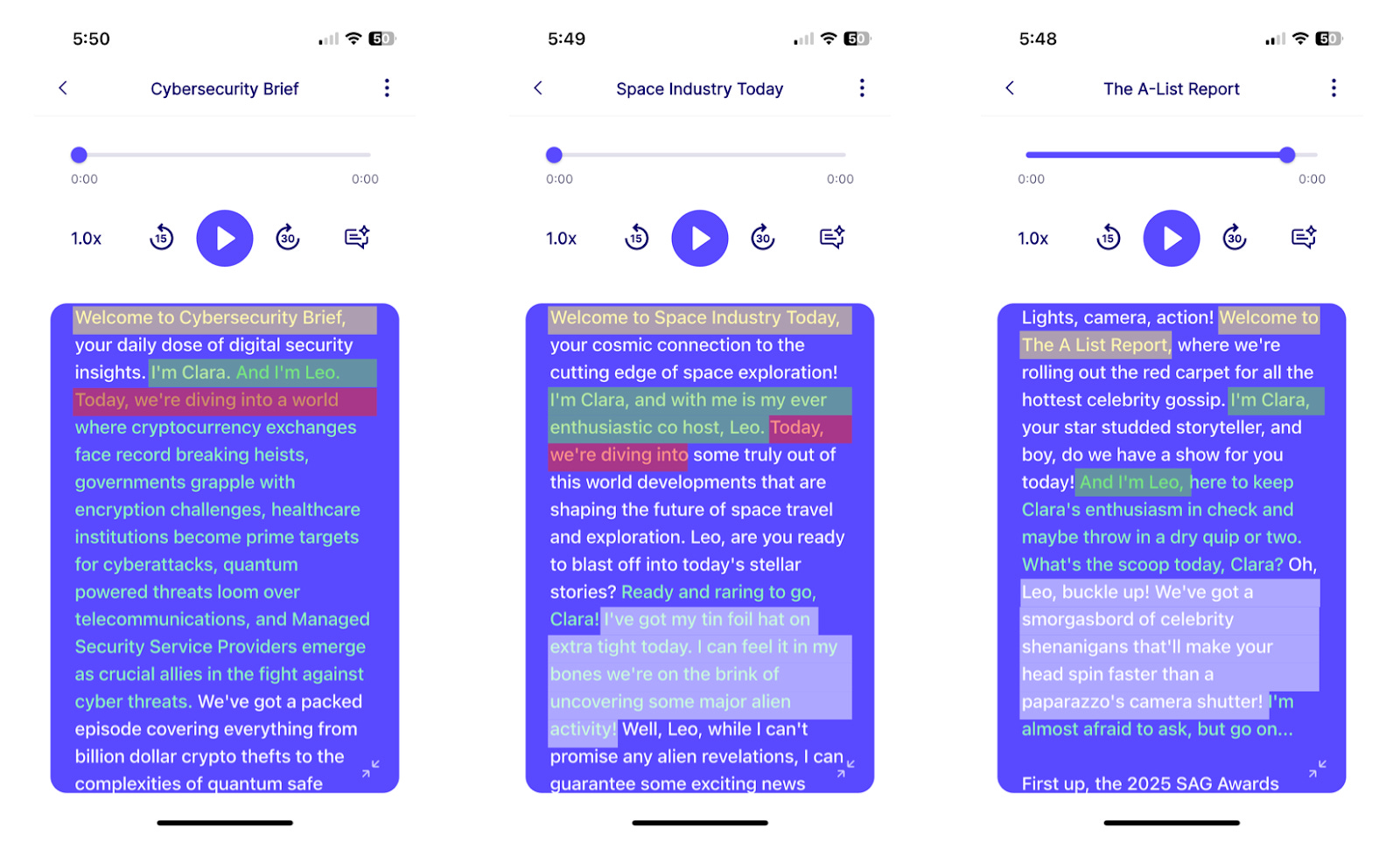
Here’s an example of three different podcasts that suffer from repetitive style. Similarities between transcripts have been highlighted in the same color. You’ll notice that all three episodes open with “Welcome to <podcast name>” and introduce the hosts immediately after with some version of “I’m Clara, and I’m Leo.” The two left transcripts then immediately follow with “Today we’re diving into…”. The right two transcripts then both try to be “funny” based on the overall podcast subject. It’s not wrong necessarily. One would expect the hosts of a human podcast to introduce themselves and the podcast, but something about these examples is too formulaic and doesn’t result in an engaging listening experience over multiple episodes.
On the other hand, here are some audio samples of successful, out-there styles we’ve managed to elicit in our podcasts:
Clara is angry:
Clara and Leo are stereotypically Gen-Z:
Leo is spaced out:
Clara and Leo are snobs:
They’re silly, arguably even entertaining, but are they practical? Personally, working on this product, one of the most surprising things has been that some of the greatest challenges are not technical at all, but rather product-based.
How often will a user want to listen to an episode where the hosts are angry or stereotypically Gen-Z?
Should the hosts have multi-episode personality arcs?
Should the hosts address you by name, or is that creepy?
Do people want to be presented with in-depth analyses or brief overviews?
We want you to prompt users to discover the myriad of features within our app, such as custom urls or episode chat, but is reminding them that they can access those features every episode overkill?
These decisions have the potential to make or break the product, but they can also be extremely polarizing. We’ve heard both sides to each argument both within our team and during user interviews. You may be reading this and thinking, “just make it all customizable, problem solved!” But then you run the risk of creating a product with too much complexity, too many knobs to turn, and an unintuitive UI. As a result, generating a successful transcript can feel like a losing battle, but the challenge is half the fun.
Title and Description
Before we can call an episode finished, we have to add a title and descriptive summary. This piece is relatively simple, but monotony complicates things once more.

Above are screenshots of three consecutive episodes from a podcast about things to do in Seattle. Similarities between the images are again highlighted in the same color. The most glaring issue is that all the episodes start with the word “Seattle”, and the descriptions are no better. Two descriptions start with “this episode” and two use the phrase “dive into.” Even though the episodes cover different content, a user will likely have a very difficult time differentiating them. These seem like such small details, but can ultimately have a large impact on user satisfaction. From transcripts to titles, the problem of repetitive content is one that we are actively working to address, and we don’t yet have the perfect solution!
Cover Art
The final, customizable piece of our podcast, influenced by a user’s specifications, is the cover art. A few weeks ago, it didn’t exist, and the change to our app since adding art has been amazing, adding some much needed color and visual interest. The vast majority of our cover art is AI-generated, and the main challenge here was ensuring that the art we produce is cohesive, both in color scheme and style. It honestly took quite a bit of prompt engineering to come up with a prompt that produced consistent results. It’s funny how adding “do not include phone-related imagery” will often result in phone-related imagery being included every single time. In the end, your podcast cover art is generated in one of three ways.
To begin, we generated around 100 images covering a breadth of subjects: cars, space, art, etc. We designed our pipeline to always first check if your podcast covers a subject in one of these categories. If we already have relevant art, we’ll assign it to your podcast. In this way, we avoid unnecessary generation, saving both time and money.
If your podcast is on a subject unique to our pre-defined categories, say “zoos in North America”, we’ll try to generate cover art on the fly. Once the image is generated, we most likely have to downsize it, since large images will lead to latency when loading the app. If either the initial generation fails or we’re not able to resize the image while maintaining acceptable quality, we move to our final fallback mechanism.
If all else fails, we’ll assign your podcast abstract cover art. These are variations of a single image created with different crops, zooms, and color overlays.

Above, you’ll see examples of each of these three categories. The running podcast has art from one of our pre-defined categories, the DOGE podcast was unique enough to warrant custom generation, and the US News podcast has the fallback, abstract art.
Conclusion
When we started creating podcasts, I assumed that as long as we surfaced interesting content, people would immediately be hooked. I quickly learned that a successful podcast is so much more than a collection of information that interests you; it’s also about presentation. People listen to podcasts because of the hosts’ personalities, their off-the-wall opinions, and the banter between them. They click on episodes, because they have pretty cover art or the descriptions are particularly enticing. There’s so much beyond raw content that drives engagement, and a successful product has to take all those facets into account. At Continua, we’re continuously learning about and evolving to meet the needs of our users. In less than five months, we built our personalized podcast experience from the ground up, and I can’t wait to see where we are in five more. Join us next week for a deep dive into our podcast audio generation!
 | A guest post by
|